
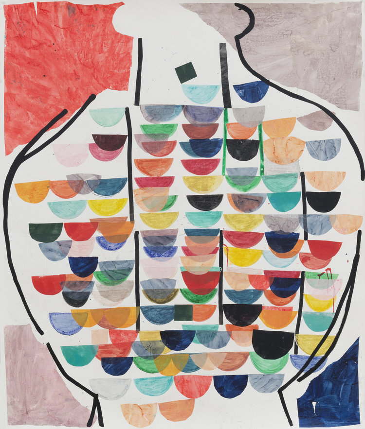
Larissa Safaryan "Eggsquisite"
Lois Lambert Gallery presents an exhibit of egg shell sculptures by artist Larisa Safaryan. Safaryan creates small delicate works, stacking and balancing intricately carved ovoid shapes, defying our assumptions of egg shells as frail.
Her process begins by choosing the right egg shell for the piece. Safaryan uses egg shells from parrots, doves, goose, quail, emu and parrots. Each bird’s egg has a different texture and thickness so that often the medium itself guides her. In other cases, she creates sketches to plan the surprising feats that these works execute.
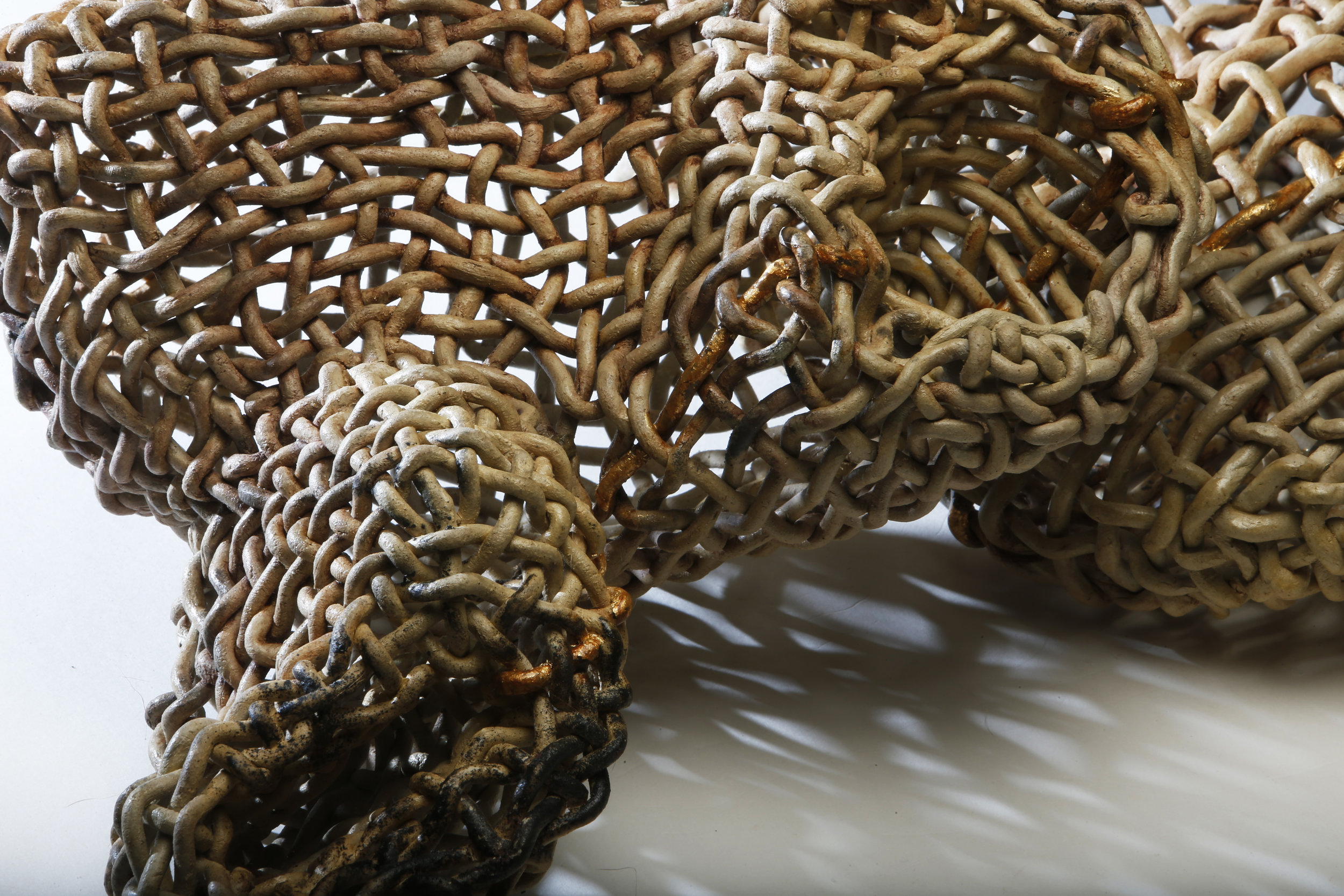
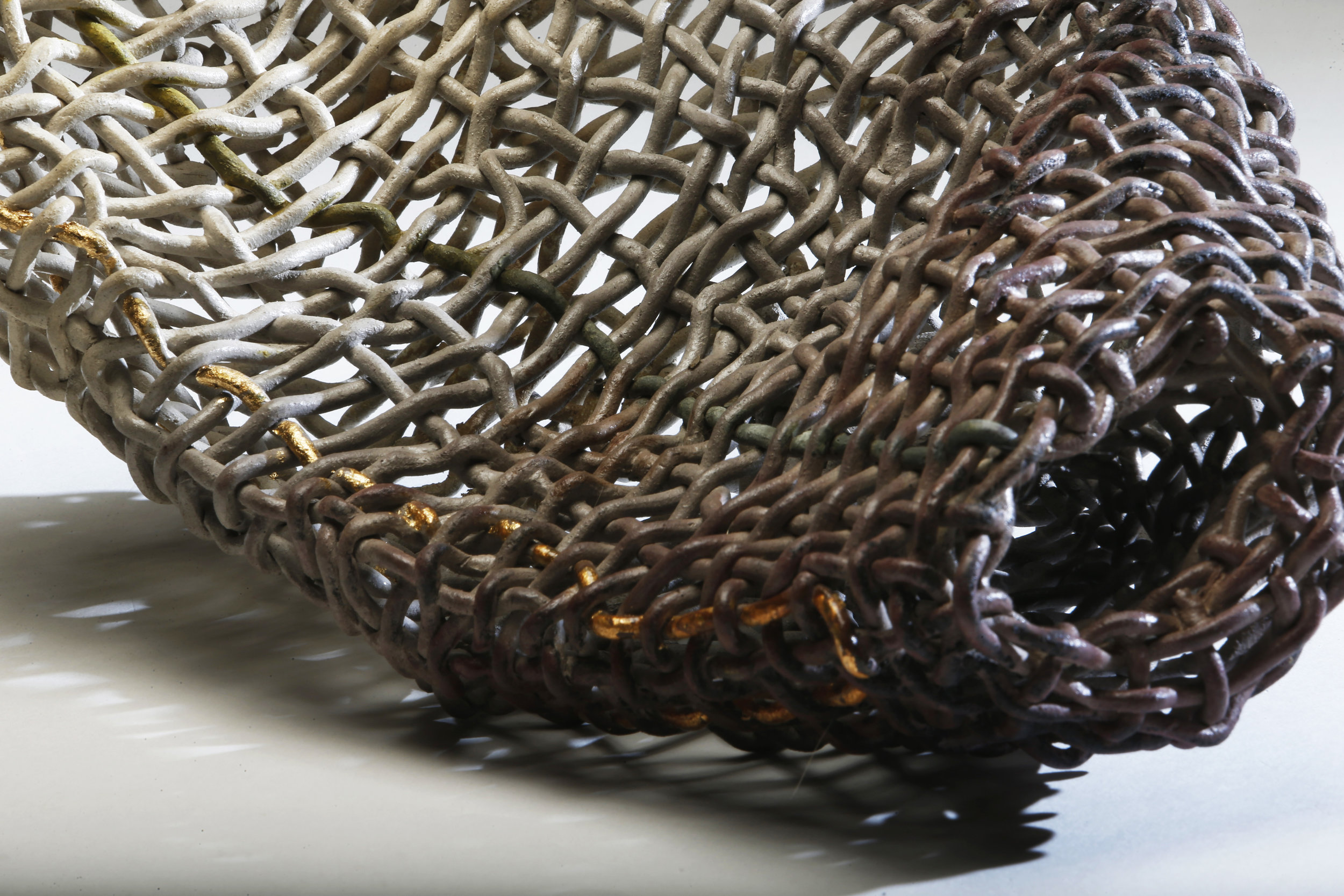
The egg has long been a rich symbol. It is a source of life, it is nourishment. It’s shell is a fragile container whose purpose is it’s eventual destruction. Intact shells are precious, surfaces to be adorned. And while decorative egg carving is a traditional craft, Safaryan has taken her egg shells in directions that transcend decorative craft, transcend novelty, and explore the formal possibilities that the ovoid possess.
In this body of work, Larisa explores the idea of freedom to create without restriction as an Existential concept, “As we are all born at a certain time and place, we’re also subject to the surrounding influences. However, while visualizing a new sculpture or paintings I rise above those influences to create something new. My creations reflect the result of my subjective interpretation of human feelings and experiences.”
In several these sculptures, eggs interact with wooden bases, and contain and eject other eggs. In others, Safaryan uses sharp pins that piece through the shells to create a precarious bed of threatening pointed edges, on which smaller intact eggs rest. The sharp and incisive metallic pins create a jarring juxtaposition against the smooth, creamy organic shells.
In other works, her patterned perforations allow us to see through the shells, and to see inside the shells, while still appreciating their creamy exteriors. These works reveal the fundamental strength of the egg by demonstrating how much of surface can in fact be removed while still maintaining the structure of the shell. However, our inherent knowledge of shells as imperilled imbues these sculptures with an emotional charge.

“Cosmic Object II” Goose and Quail egg shells, Cocobolo 5.25” x 6” x 2”
“My medium as well as my method resonates strongly with who I am as an individual, strong yet fragile, elaborate yet simple, demanding surgical precision yet having ample room and freedom for creativity.”
Larisa Safaryan was born in Yerevan, Armenia. Safaryan has a Masters degree in Psychology and a Masters degree in Public Management. Yet Larisa’s artistry is doubtlessly also inherited from her father, Nairi Safaryan, a wood sculptor known for his intricate wood carving techniques. Larisa explains that her household was the best art school she could have attended. She spent years accompanying her father to his studio, drawing alongside of him as he sculpted. Her father had an incredible collection of art history books which she spent hours reading.
Larisa Safaryan has exhibited in Los Angeles, Philadelphia, Chicago, Washington, D.C. and Yerevan, Armenia. She has won multiple awards for her artwork: the First Place Award, Glendale Art Association, Illustrious Artist Award in Calabasas, CA, and NICHE Awards Finalist in Philadelphia, PA. This is her first exhibition at the Lois Lambert Gallery.


 "Tower Blocks" mixed media size 7
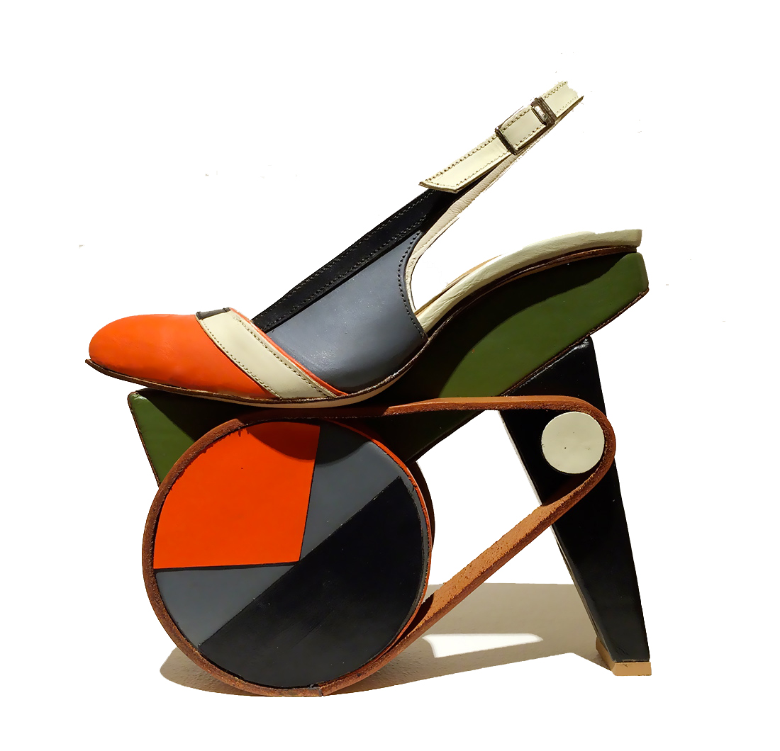
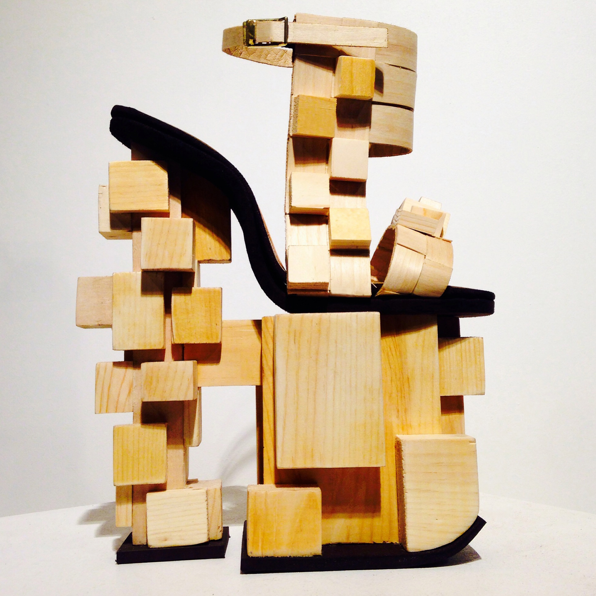
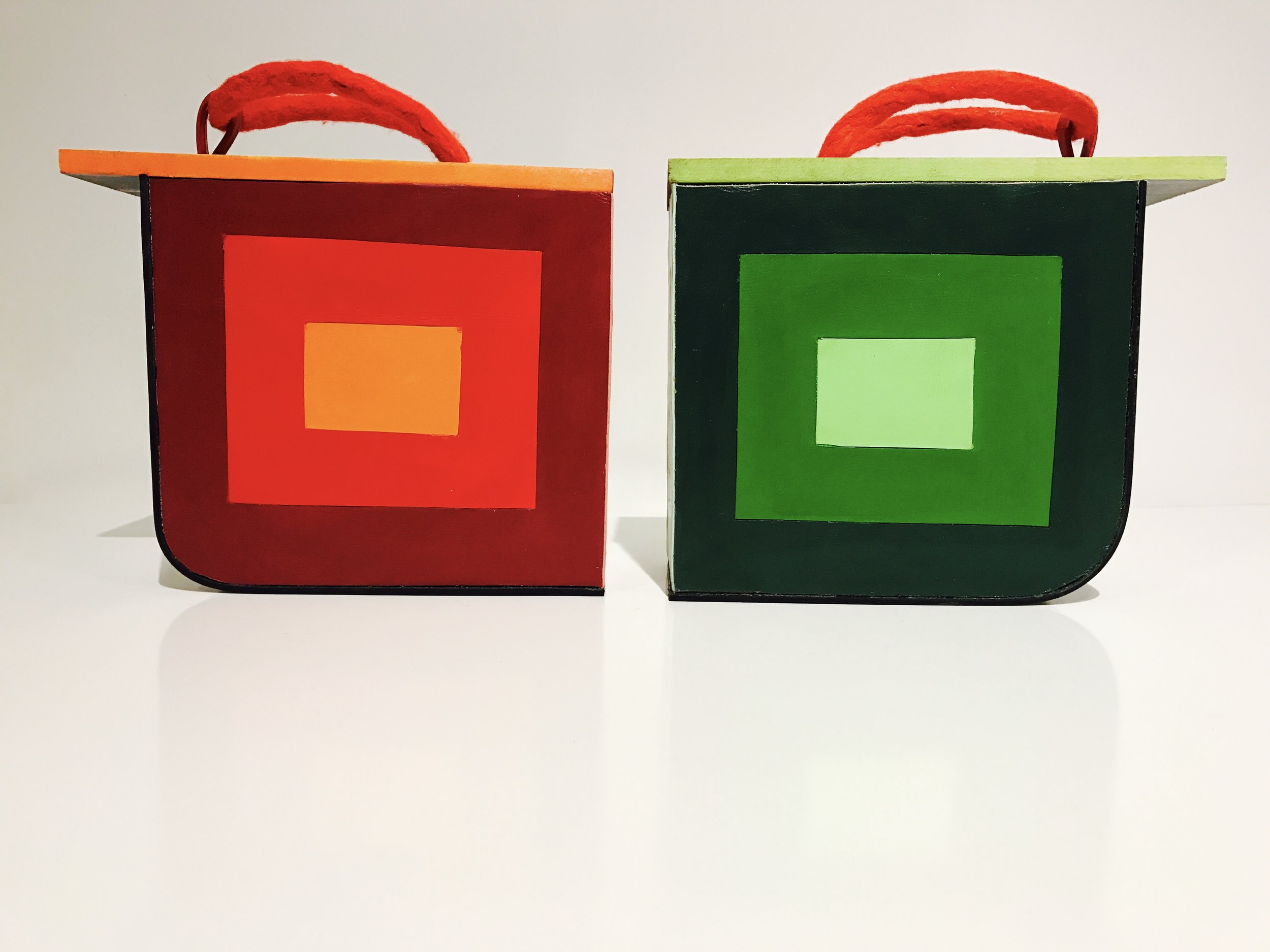 These are wood blocks and they are dedicated to Josef Albers he taught at the Bauhaus and he taught at the Black Mountain College and he taught interaction of color. So what it is, is an optical experiment with the eye so the colors, at every point on the shoe it is a different color, but this is the same color as this in here but you can't see it here because those to ends aren't together because there is an optical illusion that happens but this is the the same color as this. Because of these color fields being different it looks as though this is darker but they are the exact same color. Josef Albers was experimenting with that, really cool experiments, but it's really fun to play with. It is based off a traditional Japanese Geta, the tradition actually originated in China and these are functional- you can wear them.
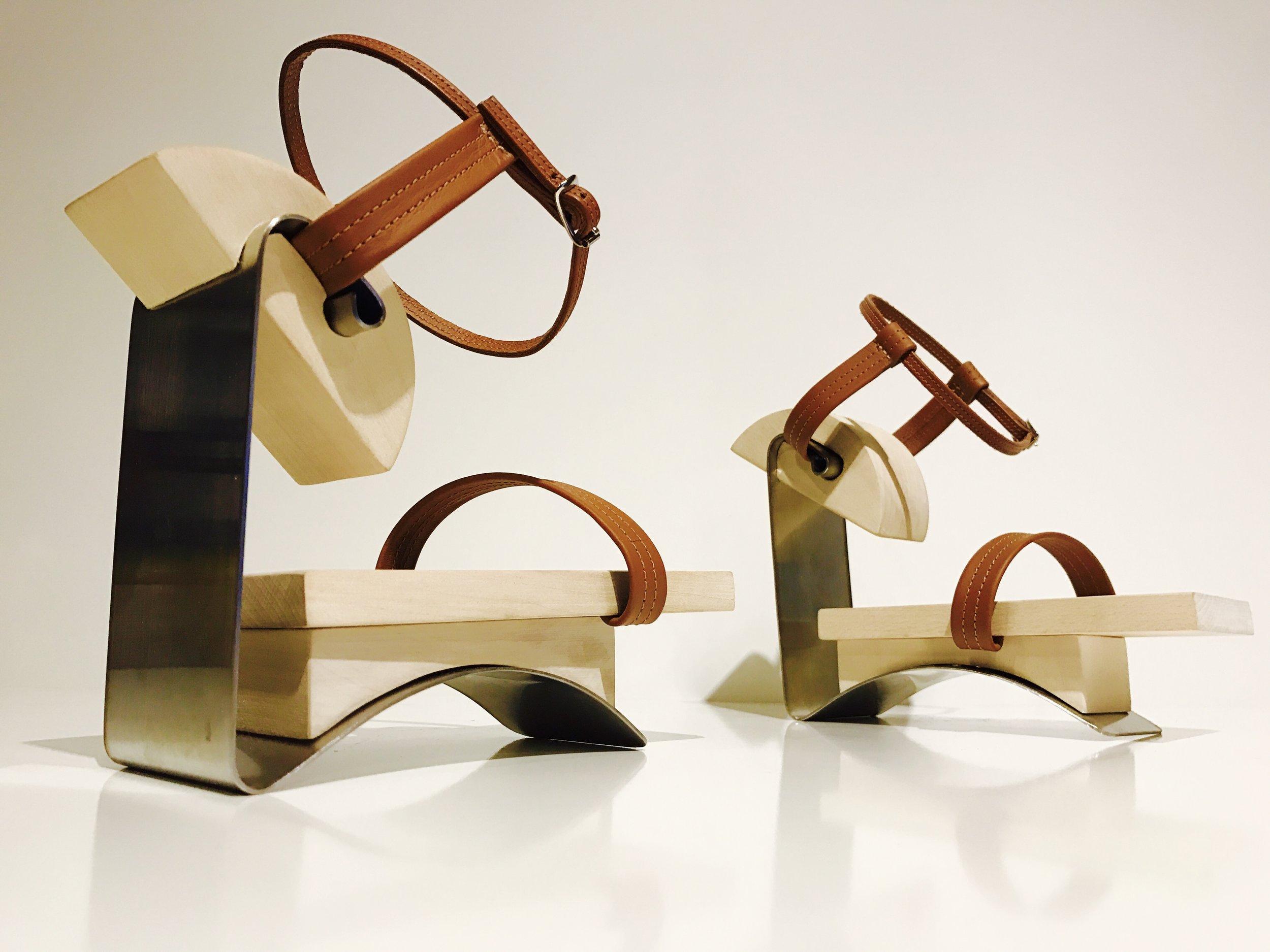
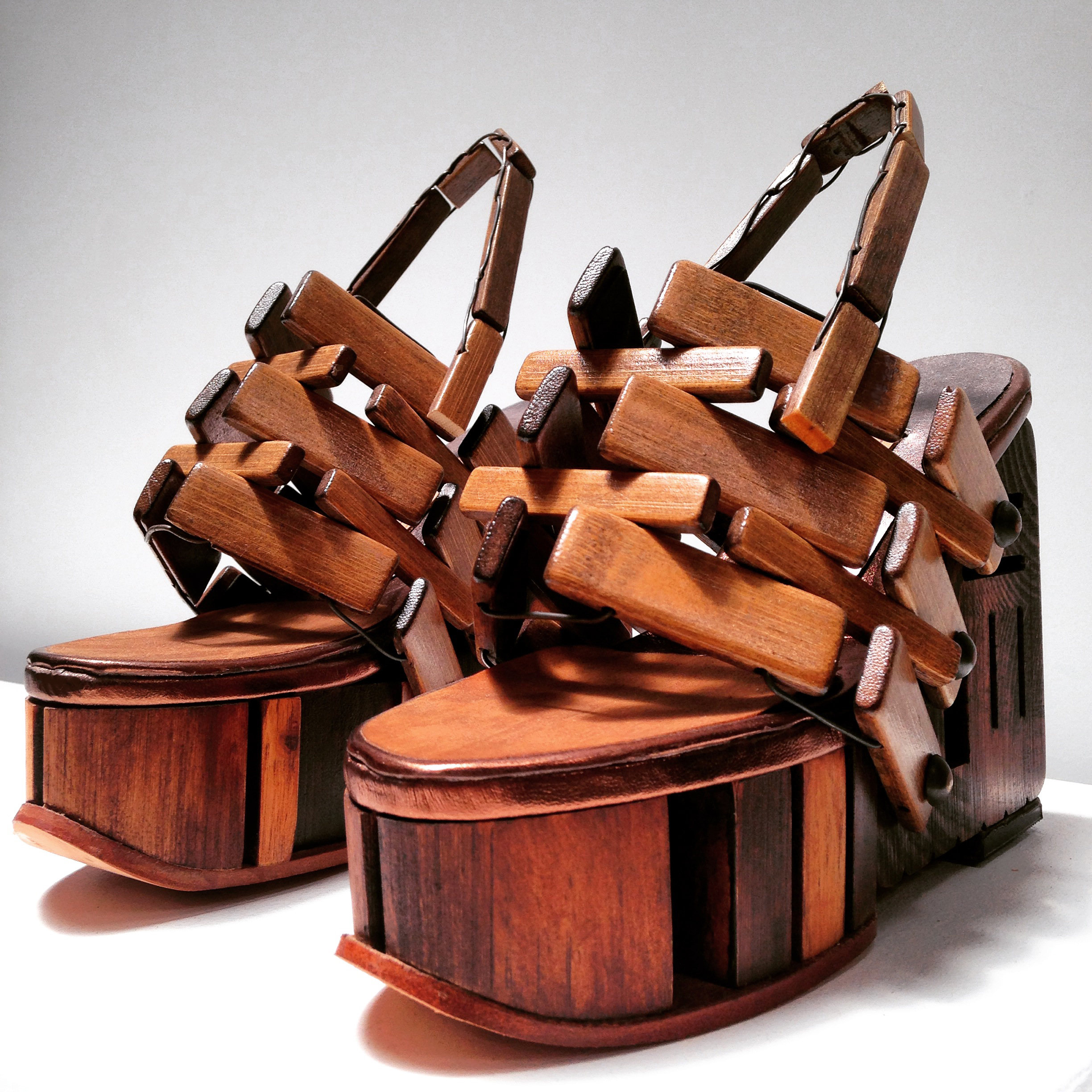
 And the idea of this also came from the Geta too. The fulcrum when your walking- your toe is forward and it makes a rocking motion, you'll see on a traditional Geta there will be a wood block further back right at the joint line in the foot and that's how you get the momentum to walk. So these are actually functional. Modern chairs for your feet.